|
Change is rarely easy. Especially when it comes to something that already feels just right.
We've all been there: a website you've lived with for years starts to feel like an old friend. It has character. It has history. It reflects the heart of your business exactly as it was when you first launched it. So why mess with perfection?
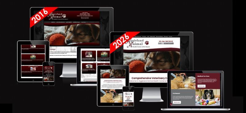
That was exactly the mindset of our recent client, Aggieland Animal Health Center, when we first spoke to discuss their site. Their original design from 2016 had served them beautifully for a full decade. It carried a warmth and personality that perfectly captured their progressive, compassionate approach to veterinary care and pet resort services. The team worried a redesign might strip away that special charm - the very thing that set them apart from other veterinary sites and made their online presence feel authentic and approachable.
We understood completely. A website isn’t just code and pixels; it’s an extension of your brand’s story. But here’s what we’ve learned after years of helping businesses evolve their digital homes: the best redesigns don’t erase the past. They honor it - then give it the tools to thrive in the present.
Preserving Personality While Embracing the Modern Web
With AAHC, our guiding principle was simple: keep the soul, update the wardrobe.
We retained every ounce of the clinic’s friendly, welcoming character - that unmistakable blend of professional expertise and genuine compassion you feel the moment you land on the site. The tone, the imagery, the core messaging all stayed front and center. What changed was the presentation.
We modernized the entire experience so the site now looks crisp and functions flawlessly on every device - from the latest smartphones to wide-screen desktops. No more pinching, zooming, or frustration. The layout breathes. The navigation flows intuitively. Visitors can find exactly what they need in seconds instead of hunting through a single crowded page.
Smart Structural Changes That Deliver Real Results
One of the biggest upgrades was separating the services into their own dedicated pages. Previously, everything lived in one long scroll - a common setup for older sites. Now each service has its own focused home: clear headlines, targeted information, and room to highlight the details clients actually care about.
Why does this matter? Two big reasons. First, it dramatically improves navigation and user experience. Second (and increasingly important), it gives search engines and the growing wave of AI-powered search tools the structured content they need to understand and surface your information accurately. When someone asks an AI assistant about preventive care or surgical options in the College Station area, the right details now rise to the top - not a vague summary of the whole site.
We also gave the staff pages a complete visual refresh. The original layout, while charming, struggled on anything but a desktop monitor. The new design uses clean, flexible grids that adapt gracefully to every screen size. Doctors’ photos, bios, and credentials now shine equally well whether someone is browsing on their phone in the waiting room or on a tablet at home. It feels polished without ever feeling cold.
And the overall aesthetic? We kept the warmth but added a contemporary twist - refined typography, improved spacing, subtle visual hierarchy, and a cohesive color palette that feels fresh yet instantly familiar. The charm didn’t disappear; it simply got a chance to sparkle.
The Proof? The Clients Themselves.
Take a look at the side-by-side comparison.
You’ll see the same friendly spirit, the same commitment to exceptional patient and client care - only now it’s presented in a way that meets modern expectations.
The AAHC team didn’t just like the changes. They *loved* them. The feedback was enthusiastic and immediate: the site still feels like *them*, only better - easier to use, more professional, and ready for whatever the next decade brings.
Why Your Website Might Be Ready for Its Own "Glow-Up"
If your site is five, eight, or ten years old, ask yourself:
- Does it load quickly and look great on a phone?
- Can visitors find information without frustration?
- Is it structured to perform well in today’s search landscape (including AI overviews)?
- Does the design still reflect the vibrant business you are *today*?
A redesign isn’t about chasing trends. It’s about removing friction so your website can work as hard as you do. It’s about respecting the original vision enough to give it the best possible stage for the future.
At the end of the day, the most successful websites aren’t the ones that never change - they’re the ones that evolve thoughtfully. They keep what people love and quietly upgrade everything else so the experience feels effortless.
If your current site is starting to show its age but still holds a special place in your heart, we’d love to talk. A redesign doesn’t have to mean starting over. It can simply mean stepping into the next chapter - with all the charm intact and all the modern advantages in place.
Your business deserves a website that feels as current and capable as the care you provide every day.
Ready to give yours a fresh chapter? Drop us a line. We’d be honored to help you keep the soul and gain the sparkle.
|